Schedule your Complimentary Design Consultation


7 Blue and Gray Pillows Styling Ideas

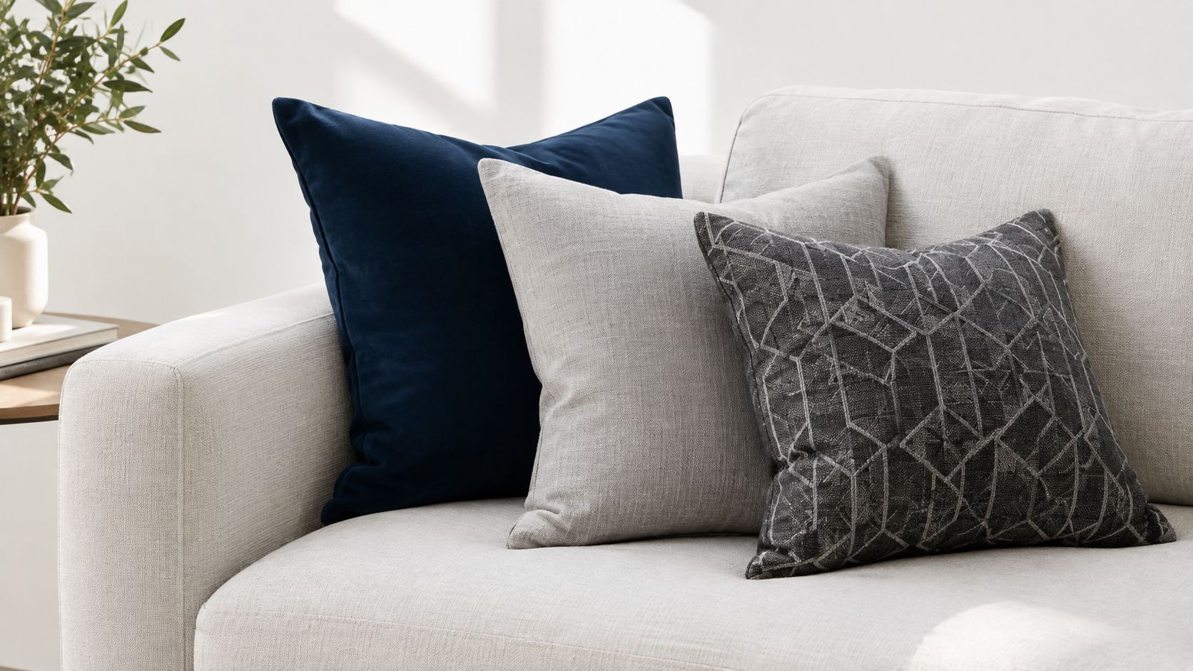
Blue and gray pillows can make a room feel coastal and inviting. They can also leave a sofa looking flat or unexpectedly cold when the undertones, pattern scale, texture, and placement don't work together. The most successful groupings usually include one grounding solid, one tactile fabric, and one purposeful pattern, with shapes that give the eye somewhere to travel.
The seven approaches below translate that idea into room-ready combinations for living rooms, bedrooms, patios, and vacation homes. Along the way, you'll see how performance fabrics, removable covers, fill, and scale affect long-term value. Indian River Furniture brings the same practical perspective to its coastal-inspired Rockledge showroom, where ownership-tested comfort, performance fabrics, genuine leathers, solid hardwood construction, and complimentary in-house design consultations help homeowners across Brevard County, the Space Coast, and Central Florida make confident choices.
1. Home Accents Upholstery Pillows From Indian River Furniture
Indian River Furniture's Upholstery Pillows collection is a focused, curated starting point for a blue-and-gray arrangement. The selection includes decorative styles from respected names such as Bassett and Barclay Butera by Lexington, giving a room designer-level polish without requiring you to coordinate every textile alone. Many styles can be ordered in a broad range of fabrics, including performance options, so the same coastal blue can be adapted from a relaxed linen-like hand to a more structured, durable weave.
A strong living-room grouping might begin with a dark gray or slate-blue square behind the sofa arm. Add a softer blue lumbar in front, then finish with a smaller pattern that repeats a color already present in the rug, artwork, or upholstery. That sequence creates depth without making the sofa feel crowded. A tightly woven cover is especially useful where pillows are handled often, while a softer tactile fabric can occupy the front position where its texture is easiest to appreciate.
Practical rule: Let one pillow carry the strongest color, one carry the richest texture, and one connect the arrangement to the room's existing palette.
Why seeing color in person helps
Online photos rarely show how blue and gray will read against your actual flooring, wall color, leather, or sunlight. In Indian River Furniture's 32,000-square-foot Rockledge showroom, curated coastal vignettes make it easier to compare cool gray, misty blue, indigo, and warmer neutrals in person. The in-house design team can also help coordinate pillows with existing furnishings through complimentary interior design consultations.
For a precise accent, consider the St. Lima Capri Blue and Dark Gray accent pillow. Indian River Furniture's ownership team has served Central Florida since 1939, with a service-first approach that extends from fabric selection to uniform white-glove delivery. A curated assortment can actually simplify decision-making because it helps narrow the field to combinations that already work well in Florida homes.
View the Indian River Furniture Upholstery Pillows collection

2. Layer Different Textures So Similar Colors Do Not Blend Together
Blue and gray are close enough in value that they can blur together without texture. This is why a room often looks more complete when a matte linen sits behind a velvet lumbar, or when a tightly woven performance fabric is paired with something nubby, washed, or softly brushed. Texture gives the eye contrast even when the colors are quiet.
For example, a large dove-gray square can act as the backdrop, a blue velvet lumbar can bring softness to the center, and a smaller woven pillow can add a slightly different hand without introducing another strong color. This kind of layering works especially well on simple sofas, sectionals, or beds that rely on textiles to create visual depth.
Insert choice matters too. Some covers are sold separately, while others include a filled insert. A structured insert creates a more tailored silhouette, while a softer fill makes the front layer more comfortable when someone actually leans against it. Before ordering, use this guide to choosing the perfect pillow to assess shape, scale, and fill.
Blue looks sophisticated beside gray when the materials differ. A matte linen and a softly reflective velvet will not compete, even when their colors are close.
3. Use Pattern in One Controlled Place
Pattern gives blue and gray pillows movement, but too much can make the arrangement feel busy. In most rooms, one clear pattern is enough. That could be a stripe, a small geometric, a border detail, or a woven design that quietly repeats the room's main colors.
The safest approach is to place the strongest pattern where it supports the grouping rather than dominates it. On a sofa, that may mean a patterned square behind a solid lumbar. On a bed, it may mean two solids at the back with one patterned pillow in front. If the rug, drapery, or artwork already has strong motion, the pillow pattern should usually be smaller and calmer.
Natural fabrics, velvet, wool blends, and indoor-outdoor textiles can all add interest without relying on loud print. The key is to use pattern as a finishing layer rather than a starting point.
A dependable formula for balanced layering
Anchor color: Use navy, slate, or mineral blue behind lighter pillows.
Softening neutral: Add dove, warm gray, or mist to keep the grouping from feeling severe.
Surface interest: Choose linen, velvet, or a woven blend so the colors stay visually distinct.
Pattern control: Limit the boldest stripe, geometric, or border to one position in the grouping.
4. Match Pillow Shapes and Sizes to the Furniture
A good color combination can still look awkward when the scale is wrong. Large sectionals typically need bigger squares to create enough visual weight, while accent chairs often look best with one smaller pillow rather than a layered stack. Beds need height at the back and a more restrained front layer if you want the arrangement to feel finished instead of overcrowded.
On a sofa, begin with the furniture width and arm height. A larger square can create the base structure, then a lumbar can lower the line and add contrast. On a bed, deeper blue pillows can sit against pale bedding, with a gray lumbar or smaller accent in front to calm the arrangement. The eye should move naturally from large to medium to small.
This is also where material matters. A leather sofa often benefits from softer textiles that offset its smooth surface, while a slipcovered or linen-upholstered piece can handle slightly more structure. The guide to upholstery materials offers useful background when you are comparing natural fibers, performance textiles, and leather furnishings.
5. Choose Performance Fabrics for Sunny, Busy, or Coastal Rooms
Blue and gray pillows often look best in bright coastal rooms, but those same spaces can be tough on fabric. Sun, humidity, moisture, repeated handling, and occasional spills all affect how a pillow ages. In a family room, vacation rental, screened porch, or patio, the right fabric can matter as much as the color.
Performance options from Sunbrella and Perennials are worth considering for spaces that see heavy use or strong daylight. Outdoor-rated textiles can also work indoors, particularly when easy maintenance matters. Moisture and stain behavior are important in Florida-friendly interiors, and performance textiles are often engineered for lower moisture absorption and greater resistance to liquid penetration, as explained in this textile standards guide for coastal furniture.
If you are shopping broadly, product details still matter. Read carefully to confirm whether you are buying a cover only or a full pillow with insert. For a more durable grouping, look for tightly woven fabrics and clear care instructions. The Schumacher abrasion guide explains why Wyzenbeek testing uses double rubs and why higher counts generally indicate greater resistance to fraying, pilling, and tearing.
Material check: Color tells you whether pillows coordinate. Fabric construction tells you whether they belong in the room's daily life.
6. Repeat Blue and Gray Across Multiple Rooms Without Overmatching
Blue and gray work well across living rooms, bedrooms, guest rooms, patios, and vacation homes because the palette is flexible. The goal is not to repeat the exact same pillow everywhere. Instead, repeat the feeling of the palette while shifting the scale, shape, or texture from room to room.
For example, a family room might use a woven gray square with a soft blue lumbar, while a guest bedroom picks up the same blue in a quieter stripe. A patio could use a stronger indigo with a washable gray performance textile. Repetition creates continuity, but variation keeps the home from looking staged.
In Brevard County and along the Space Coast, this approach works particularly well in homes that balance relaxed coastal styling with everyday practicality. The same palette can feel polished in a formal living room, easygoing in a family room, and durable enough for a vacation property or patio.
Where this palette works best
Family rooms: Pair a durable gray base with a softer blue accent.
Guest bedrooms: Use a restrained stripe or woven detail for a calm coastal look.
Vacation rentals: Favor removable covers, easy-care fabrics, and colors that disguise everyday handling.
Accent chairs: Choose one smaller patterned pillow instead of building a full layered arrangement.
7. Build a Pillow Plan That Fits the Whole Room
The best blue and gray pillow arrangement is the one that reflects the whole room rather than just the sofa. Start by looking at the dominant undertone in the flooring, walls, upholstery, metal finishes, and nearby fabrics in both daylight and evening light. A cool blue-gray can feel fresh beside crisp white and watery coastal hues, while a warmer gray can keep the same blue from looking washed out.
Choose one anchor blue or gray, then build around it. Add a contrasting texture next. Linen, velvet, performance weave, leather trim, and nubby upholstery all reflect light differently, which helps close colors remain distinct. Finish with one controlled pattern, then check its scale against the furniture. A broad stripe belongs on a larger surface, while a small geometric or windowpane pattern is often better in front.
Do not overlook practical performance. Check whether covers can be removed, whether the fabric suits children, pets, rentals, or patio use, and whether the fill feels supportive rather than merely decorative. For frequently handled pillows, ACT guidance places woven upholstery fabrics around 15,000 Wyzenbeek double rubs or 20,000 Martindale cycles in the range associated with low-traffic or private spaces, and around 30,000 double rubs or 40,000 Martindale cycles for high-traffic or public settings. See the ACT abrasion guidance when performance specifications matter.
Blue and Gray Pillow Styling Checklist
| What to check | Why it matters | Quick guideline |
|---|---|---|
| Undertone | Prevents blue and gray from clashing with the room | Match cool colors with cool rooms, warm grays with warmer finishes |
| Anchor pillow | Gives the arrangement structure | Start with the darkest or largest pillow |
| Texture contrast | Keeps similar colors from blending together | Mix linen, velvet, woven, or performance surfaces |
| Pattern scale | Adds interest without visual noise | Use one main pattern and keep it proportional to the furniture |
| Shape and size | Helps pillows fit the furniture correctly | Larger sofas need larger squares, chairs need restraint |
| Fabric performance | Supports longevity in real life | Check sunlight, moisture, pets, spills, and abrasion needs |
| Insert and fill | Changes appearance and comfort | Choose a firmer back layer and a comfortable front layer |
Turn Inspiration Into a Room Plan
A successful pillow plan does not start with buying several pretty covers at once. It starts with identifying what the room needs most. Some rooms need warmth. Others need softness, stronger contrast, or a fabric that can stand up to sunlight and everyday use. Blue and gray are versatile enough to solve all of those problems when they are layered with purpose.
Indian River Furniture helps homeowners make those choices in person by pairing curated coastal styling with practical construction knowledge. Seeing pillows next to upholstery, wood finishes, leather, and lighting conditions can save time and reduce expensive trial and error. If you already have a sofa, sectional, bed, or chair you want to update, bringing photos and room measurements can make the conversation even more productive.
Make the final decision in person
Colorfastness deserves attention in sunny Florida rooms. The gray scale rates staining and color change on a 1-to-5 scale, while the blue wool scale uses eight grades for lightfastness, as described by the AATCC gray scale resource. Testing color transfer with water and then with the intended cleaning solution can help protect adjacent upholstery and bedding.
Local homeowners can visit Indian River Furniture's 32,000-square-foot Rockledge showroom to hand-test seating, see curated coastal vignettes, and work directly with the in-house design team. Established in 1939, the store serves Brevard County, the Space Coast, and Central Florida with performance fabrics, genuine leathers, solid hardwood frames, and a no-blind-ordering promise. The ownership team hand-tests every seat, sofa, and recliner for pitch, structural integrity, and comfort before it reaches the showroom floor. Uniform in-house white-glove delivery is available for a standard $99 fee within the service area.
Visit Indian River Furniture in Rockledge to compare blue and gray pillows with coastal upholstery, performance fabrics, genuine leather, and comfortable seating in person. Bring a photo of your room, use the complimentary in-house design consultation, and let the team help you create a grouping built for Florida living.